TWS reveals a new logo

A fresh but familiar owl flies onto the scene

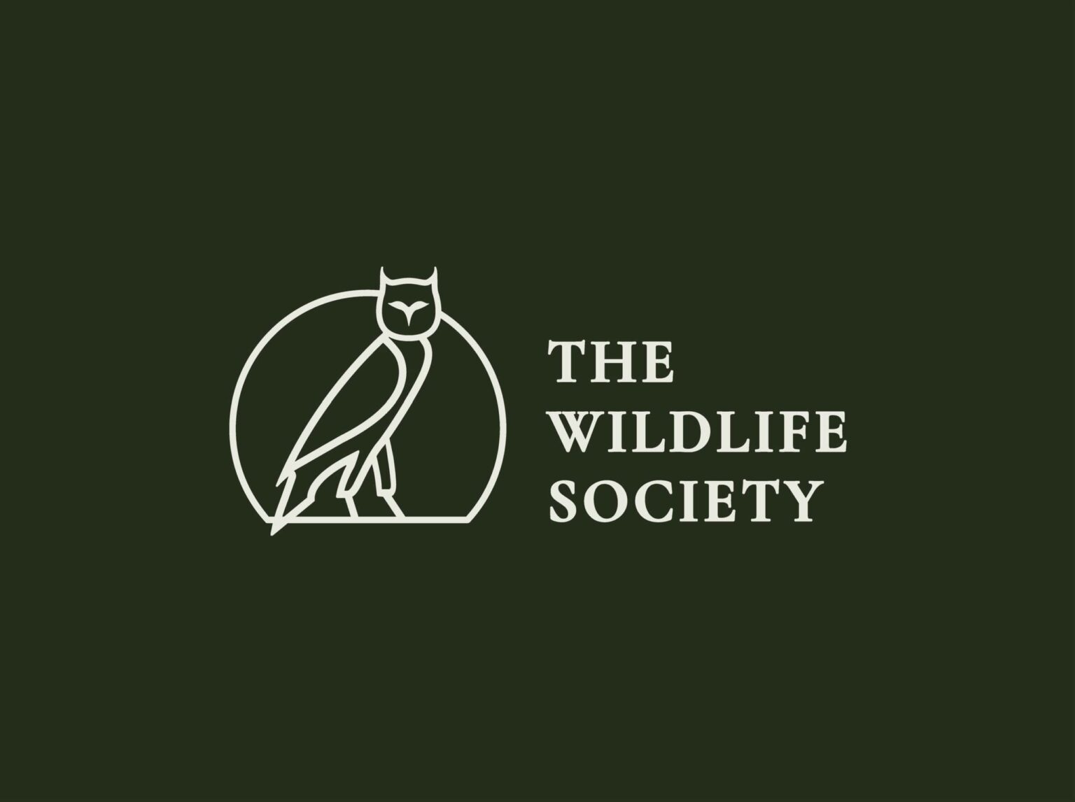
The Wildlife Society has unveiled a new logo that highlights TWS’ history while creating a fresh, modern look. “I’m excited about the new look and changes at The Wildlife Society as we move our professional society into the future while honoring our past,” said TWS CEO Ed Arnett.

It was a team effort to shepherd the logo into its new iteration, which was led by Mariah Beyers, the TWS director of member engagement. Beyers has been on staff for 11 years and was a TWS student member before that. She said the rebrand has been like “watching an old friend grow into a new chapter.”

Along with the new logo, TWS has adopted a new color palette, which includes a deep forest green.

Previous editions of Wildlife Society Bulletin included inspirations for the new logo, like this very first issue from 1973. Credit: Mariah Beyers/TWS

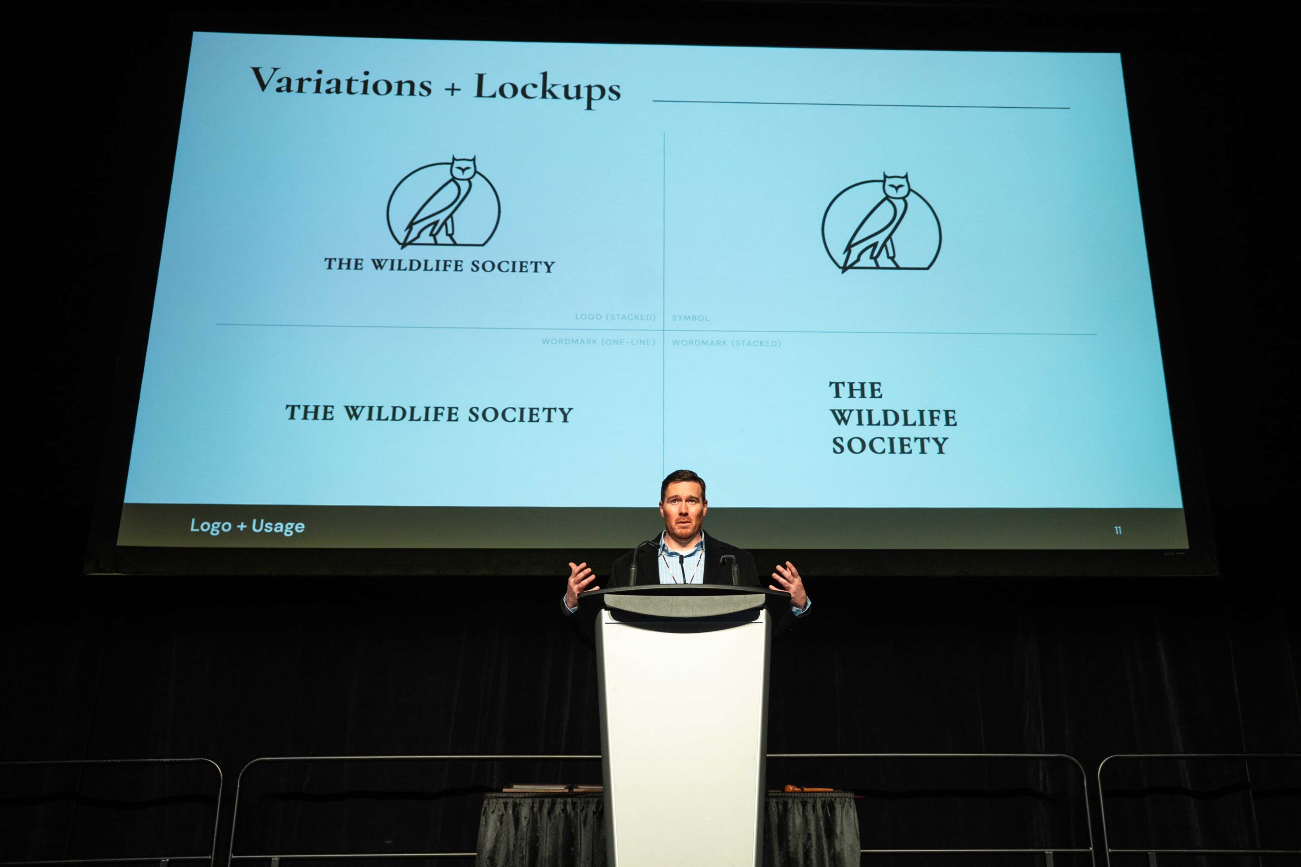
TWS staff worked closely with artists from Chariot Creative, a Raleigh-based marketing agency. Jason Cooke, the president and co-founder of Chariot, presented the logo and new color scheme at TWS’ annual conference in Edmonton, Alberta.

“It’s been incredibly rewarding to help shape a brand that celebrates our history and looks ahead to what’s next,” Beyers said.

Jason Cooke of Chariot Creative presents the new TWS logo at the annual conference in Edmonton, Alberta. Credit: Katie Perkins/TWS

Honoring history

The search for a logo for The Wildlife Society started in 1937 when The Journal of Wildlife Management first began soliciting papers. The editor at the time, W. L. McAtee, wanted a “simple, well-composed design” that was representative of different kinds of animals within the field of wildlife management. The secretary of TWS at the time, Victor Cahalane, suggested that Egyptian hieroglyphics might work well for such a design. National Park Service artist Walter Weber created the memorable logo in a pen and ink drawing.

TWS logo hi res

The original TWS logo, created in 1937, will now serve as a legacy logo and will continue to be used on TWS journals and books. Credit: TWS

The owl has long been an important mascot for TWS, including its use in this newsletter from 1939. Credit: Mariah Beyers/TWS

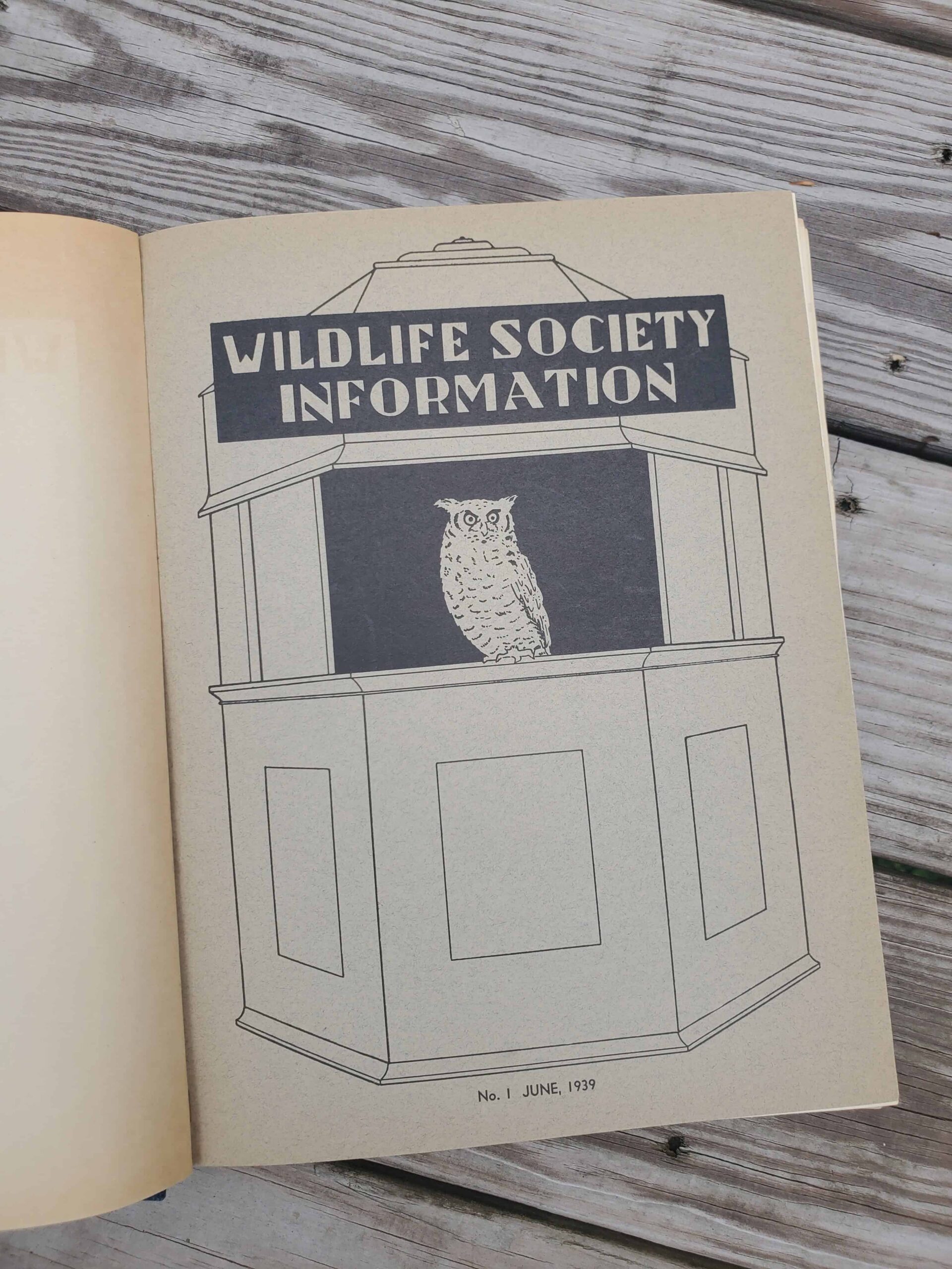
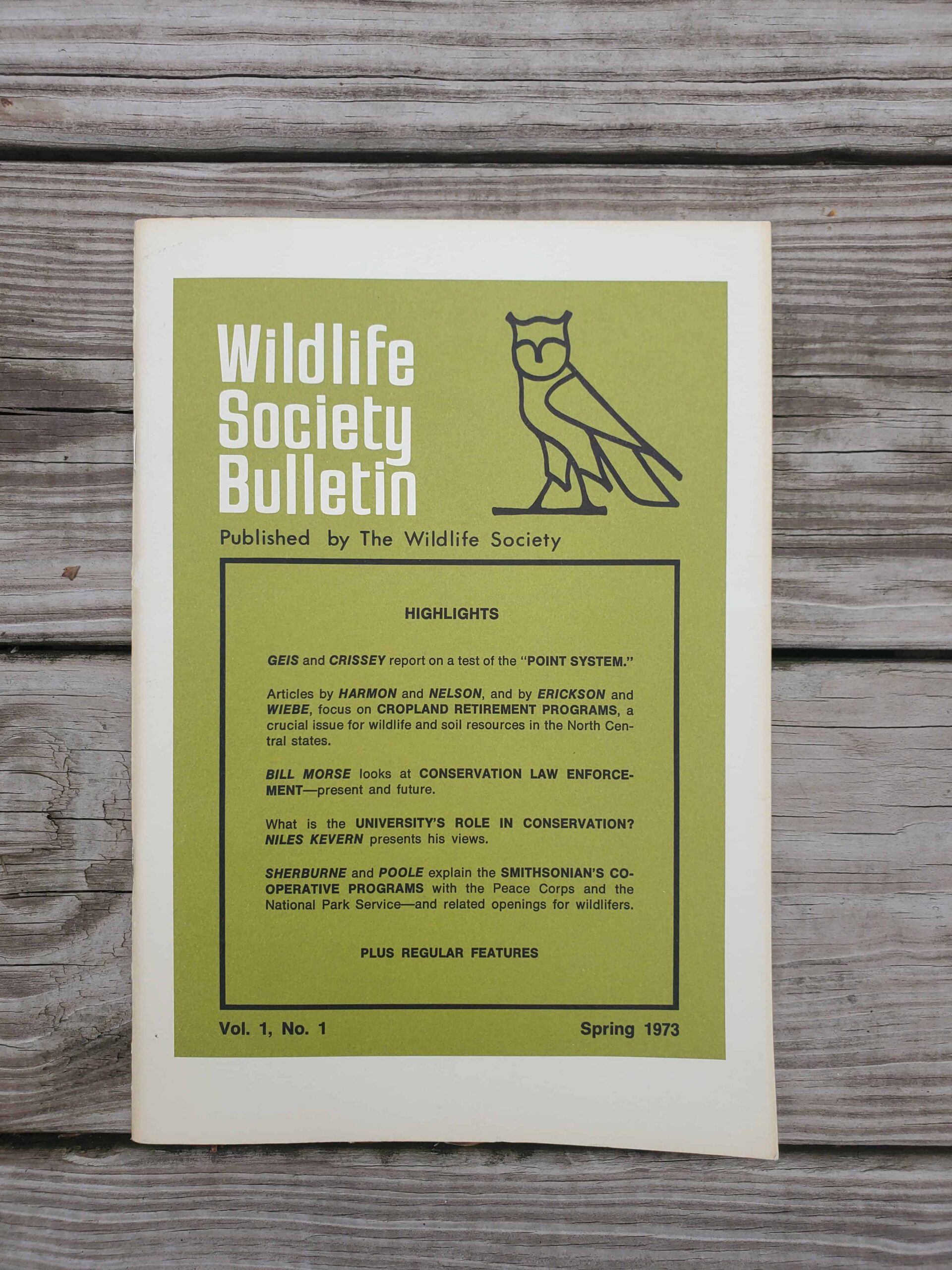
Over the years, TWS’s logo has changed very little, except for the addition of the words “The Wildlife Society” within a red frame. The owl, though, which appears within the center of the logo, has appeared on numerous TWS publications and newsletters throughout the years, including Wildlife Society Bulletin.

TWS_Logo_Dark_Horizontal

The new TWS logo includes an owl silhouetted by the rising sun. Credit: TWS/Chariot Creative

The new logo, which is an owl silhouetted by the rising sun, is a nod to the historic style and significance of the animal throughout the years. The legacy logo won’t be phased out entirely and will still be used on TWS journals and books. “Use of the owl from our current logo was a conscious decision that honors our past while generating a more contemporary and simplified look for the organization moving forward,” Arnett said.

Header Image: The new TWS logo includes an owl silhouetted by the rising sun. Credit: TWS/Chariot Creative